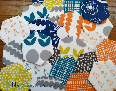
The Joys of Hex, Day 7

Discovered these 40 GFG blocks in a thrift shop in Cape May, NJ One last quilt from my Hexagon Quilt Vault. Way back when my 3 daughters were small (early 1990s) we took a little vacation to Cape May, New Jersey and stayed in a friend's beach house. I took a trip into town and discovered these 45 antique blocks in a thrift shop and the price tag was HUGE (for me): $50! I buried them behind some other items, dashed out of the store and consulted with my husband. He said, sure - go get them. Of course, it helped that I still had a few $20 traveler's checks in my wallet (no ATMs back then). I went the next day, bought them. Took them home. Stroked them. And then my insides melted into butter - these things were hand pieced and there was no way I was going to finish them by hand piecing!! What did I do? I trimmed them, ironed the raw edges under, machine sewed them into vertical rows onto green background strips, sewed the strips together and I had my quilt! The double bed it...


